I was lucky enough to be able to go to Boston for the Photoshop World conference in Spring 2009. I had never been to Boston before and I couldn't wait to take it all in. Once we got to our hotel room I noticed this building outside of our hotel window. It was highly reflective and I love the way it caught the light. I took one picture in the late afternoon and the other just after dusk.
The Photoshop Conference was amazing and I learned so much. But the most surprising source of inspiration came from a photographer named Jay Maisel.
The Photoshop conference has multiple class going on at the same time. At that specific time there were no classes pertaining to design so I wondered into Jay Maisel's class. I wasn't expecting to get much out of it because at the time I was not especially interested in photography.
Mr. Maisel went up to give his presentation and I was blown away. He did one segment relating to 9/11. He went to photograph ground zero but he was told he not allowed. Instead he photographed the faces of the people as they walked past where the twin towers once stood. The people were unaware they were being photographed and he ended up with some very raw and emotional portraits.
He then showed a series of photographs he had taken over the years. They were full of interesting perspectives, unusual light, bold color, and expressive gestures. His photographs reminded me of how I see the world. I always end up noticing these interesting and unique things but I never take pictures of them because I though no one would ever find them as interesting as I did. Jay was taking the pictures that I was too shy to take. I left that class and saw the world in a whole new way.
I decided to stop taking pictures like a tourist and and start taking pictures like an artist.
This was a piece of Iranian art from the Boston Museum. Rather than getting a "perfect shot" I captured the reflection of the window because it was made to fit the style of the art work in the room.
Instead of trying to get the entire statue in one shot I focus on what drew me to look at it in the first place. I loved the serenity in their faces and the subtle colors in the background.
One of my favorites! Instead of only filling the photo with the statue, I stood back and gave him a setting.
I loved the simple elegance and the quiet reflection of their face along with their juxtaposition against the wall.
The Boston sky at dusk.

Instead of taking this shot at eye level I crouched down next to the statue and pointed the camera up towards the ceiling. I think the dynamic angle really makes the shot. I love how it looks like she is reaching up for the light.

This piece of art was in a room filled with artifacts that related to the afterlife. I have no idea whether it was intentional or not, but this was placed over and exit sign and I thought it was hilarious.
Once again, rather than taking a picture of the entire statue I decided to focus on what I was most attracted to. The face, the gesture, and the reflection of the window made this image memorable.
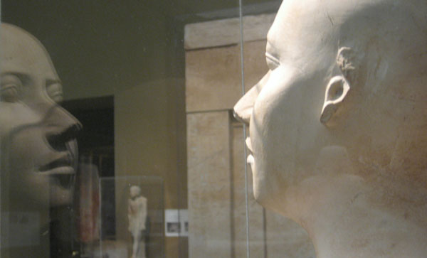
This was a practice cast of a bust. This was something that never would have been on display in ancient Egypt, it was only meant for the sculptor to use as a reference. Simple objects like these tend to make me think more about the individual artist who created them. Almost like you are so close to being able to look back in time because you are so close to an object they have touched. That is why I took a picture that included the objects reflection.

This particular statue was enormous. When in front of it you were forced to look up towards the ceiling. It happened to be raining outside and I wanted to capture the beauty of the statue's face as well as the rain cascading down the skylight.
I love the way this historic church is surrounded by all of these modern sky scrappers that vanish into the fog. Only the light from the windows lets you know how far up the building rises.
A statue of an angel with outstretched arms in the Boston rain.

This was taken the morning I was leaving to go back to Orlando. It was raining but still wanted to see as much of the city as I possibly could. I'm so glad I went out that morning.
There is still beauty in a cloudy day.


